Say that you were looking at writing scores broken down by race and ses. You might want to graph the mean and confidence interval for each group using a bar chart with error bars as illustrated below. This FAQ shows how you can make a graph like this, building it up step by step.

First, lets get the data file we will be using.
use https://stats.idre.ucla.edu/stat/stata/notes/hsb2, clear
Now, let’s use the collapse command to make the mean and standard deviation by race and ses.
collapse (mean) meanwrite= write (sd) sdwrite=write (count) n=write, by(race ses)
Now, let’s make the upper and lower values of the confidence interval.
generate hiwrite = meanwrite + invttail(n-1,0.025)*(sdwrite / sqrt(n))
generate lowrite = meanwrite - invttail(n-1,0.025)*(sdwrite / sqrt(n))
Now we are ready to make a bar graph of the data The graph bar command makes a pretty good bar graph.
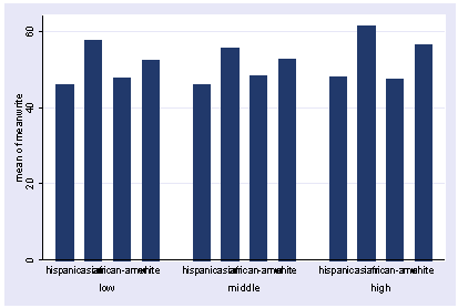
graph bar meanwrite, over(race) over(ses)
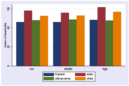
We can make the graph look a bit prettier by adding the asyvars option as shown below.
graph bar meanwrite, over(race) over(ses) asyvars
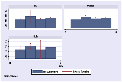
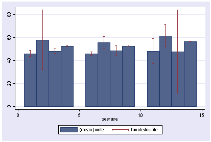
But, this graph does not have the error bars in it. Unfortunately, as nice as the graph bar command is, it does not permit error bars. However, we can make a twoway graph that has error bars as shown below. Unfortunately, this graph is not as attractive as the graph from graph bar.
graph twoway (bar meanwrite race) (rcap hiwrite lowrite race), by(ses)
So, we have a conundrum. The graph bar command will make a lovely bar graph, but will not support error bars. The twoway bar command makes lovely error bars, but it does not resemble the nice graph that we liked from the graph bar command. However, we can finesse the twoway bar command to make a graph that resembles the graph bar command and then combine that with error bars. Here is a step by step process.
First, we will make a variable sesrace that will be a single variable that contains the ses and race information. Note how sesrace has a gap between the levels of ses (at 5 and 10).
generate sesrace = race    if ses == 1
replace  sesrace = race+5  if ses == 2
replace  sesrace = race+10 if ses == 3
sort sesrace
list sesrace ses race, sepby(ses)

     +---------------------------------+
     | sesrace      ses           race |
     |---------------------------------|
  1. |       1      low       hispanic |
  2. |       2      low          asian |
  3. |       3      low   african-amer |
  4. |       4      low          white |
     |---------------------------------|
  5. |       6   middle       hispanic |
  6. |       7   middle          asian |
  7. |       8   middle   african-amer |
  8. |       9   middle          white |
     |---------------------------------|
  9. |      11     high       hispanic |
 10. |      12     high          asian |
 11. |      13     high   african-amer |
 12. |      14     high          white |
     +---------------------------------+
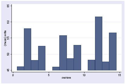
Now, we will make a graph using graph twoway. Notice how the bars are in three groups of four bars. The three groups correspond to the three levels of ses and the four bars within each group correspond to the four levels of race. You can relate this grouping to the way that we constructed raceses above.
twoway (bar meanwrite sesrace)
We can now overlay the error bars by overlaying a rcap graph
twoway (bar meanwrite sesrace) (rcap hiwrite lowrite sesrace)
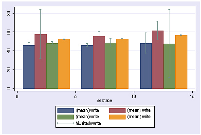
This kind of looks like what we want, but it would look nicer if each of the bars for the four different races were different colors. We can do this by overlaying four separate bar graphs, one for each racial group.
twoway (bar meanwrite sesrace if race==1) ///
       (bar meanwrite sesrace if race==2) ///
       (bar meanwrite sesrace if race==3) ///
       (bar meanwrite sesrace if race==4) ///
       (rcap hiwrite lowrite sesrace)
This is looking better, but let’s use the legend to label the bars better.twoway (bar meanwrite sesrace if race==1) /// (bar meanwrite sesrace if race==2) /// (bar meanwrite sesrace if race==3) /// (bar meanwrite sesrace if race==4) /// (rcap hiwrite lowrite sesrace), /// legend( order(1 "Hispanic" 2 "Asian" 3 "Black" 4 "White") )

The legend labels the bars nicely but would look cleaner if it were just one row and the x axis of the graph does not convey that the three groups of bars correspond to the three groups of ses. We can use the xlabel() option to remedy that. We also add better titles for the x and y axes as well.
twoway (bar meanwrite sesrace if race==1) ///
       (bar meanwrite sesrace if race==2) ///
       (bar meanwrite sesrace if race==3) ///
       (bar meanwrite sesrace if race==4) ///
       (rcap hiwrite lowrite sesrace), ///
       legend(row(1) order(1 "Hispanic" 2 "Asian" 3 "Black" 4 "White") ) ///
       xlabel( 2.5 "Low" 7.5 "Middle" 12.5 "High", noticks) ///
       xtitle("Socio Economic Status") ytitle("Mean Writing Score")
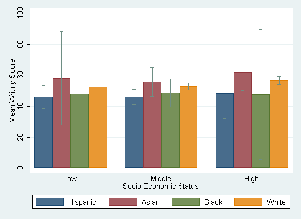
Now we have a graph that looks like the kind of graph that we would get from graph bar but by finessing graph twoway bar into making this pretty graph, we could then overlay the rbar graph to get the error bars we desired.
Prepared by:
Neil M.
Source:
No comments:
Post a Comment