Monday, July 29, 2019
Friday, July 26, 2019
Regression Analysis: Overview
Overview


What is regression analysis and what does it mean to perform a regression?
How does regression analysis work?


Why should your organization use regression analysis?
Regression analysis is helpful statistical method that can be leveraged across an organization to determine the degree to which particular independent variables are influencing dependent variables.
The possible scenarios for conducting regression analysis to yield valuable, actionable business insights are endless.
The next time someone in your business is proposing a hypothesis that states that one factor, whether you can control that factor or not, is impacting a portion of the business, suggest performing a regression analysis to determine just how confident you should be in that hypothesis! This will allow you to make more informed business decisions, allocate resources more efficiently, and ultimately boost your bottom line.
An Interactive Guide To The Fourier Transform
An Interactive Guide To The Fourier Transform


- What does the Fourier Transform do? Given a smoothie, it finds the recipe.
- How? Run the smoothie through filters to extract each ingredient.
- Why? Recipes are easier to analyze, compare, and modify than the smoothie itself.
- How do we get the smoothie back? Blend the ingredients.
- The Fourier Transform takes a time-based pattern, measures every possible cycle, and returns the overall "cycle recipe" (the amplitude, offset, & rotation speed for every cycle that was found).
From Smoothie To Recipe

- Pour through the "banana" filter. 1 oz of bananas are extracted.
- Pour through the "orange" filter. 2 oz of oranges.
- Pour through the "milk" filter. 3 oz of milk.
- Pour through the "water" filter. 3 oz of water.
- Filters must be independent. The banana filter needs to capture bananas, and nothing else. Adding more oranges should never affect the banana reading.
- Filters must be complete. We won't get the real recipe if we leave out a filter ("There were mangoes too!"). Our collection of filters must catch every possible ingredient.
- Ingredients must be combine-able. Smoothies can be separated and re-combined without issue (A cookie? Not so much. Who wants crumbs?). The ingredients, when separated and combined in any order, must make the same result.
See The World As Cycles
- Start with a time-based signal
- Apply filters to measure each possible "circular ingredient"
- Collect the full recipe, listing the amount of each "circular ingredient"
- If earthquake vibrations can be separated into "ingredients" (vibrations of different speeds & amplitudes), buildings can be designed to avoid interacting with the strongest ones.
- If sound waves can be separated into ingredients (bass and treble frequencies), we can boost the parts we care about, and hide the ones we don't. The crackle of random noise can be removed. Maybe similar "sound recipes" can be compared (music recognition services compare recipes, not the raw audio clips).
- If computer data can be represented with oscillating patterns, perhaps the least-important ones can be ignored. This "lossy compression" can drastically shrink file sizes (and why JPEG and MP3 files are much smaller than raw .bmp or .wav files).
- If a radio wave is our signal, we can use filters to listen to a particular channel. In the smoothie world, imagine each person paid attention to a different ingredient: Adam looks for apples, Bob looks for bananas, and Charlie gets cauliflower (sorry bud).
Think With Circles, Not Just Sinusoids
- A "sinusoid" is a specific back-and-forth pattern (a sine or cosine wave), and 99% of the time, it refers to motion in one dimension.
- A "circle" is a round, 2d pattern you probably know. If you enjoy using 10-dollar words to describe 10-cent ideas, you might call a circular path a "complex sinusoid".

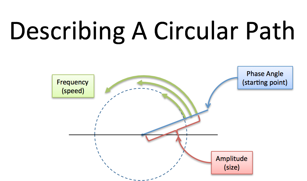
Following Circular Paths
- How big is the circle? (Amplitude, i.e. size of radius)
- How fast do we draw it? (Frequency. 1 circle/second is a frequency of 1 Hertz (Hz) or 2*pi radians/sec)
- Where do we start? (Phase angle, where 0 degrees is the x-axis)
[0 1] means- 0 amplitude for the 0Hz cycle (0Hz = a constant cycle, stuck on the x-axis at zero degrees)
- 1 amplitude for the 1Hz cycle (completes 1 cycle per time interval)
- The blue graph measures the real part of the cycle. Another lovely math confusion: the real axis of the circle, which is usually horizontal, has its magnitude shown on the vertical axis. You can mentally rotate the circle 90 degrees if you like.
- The time points are spaced at the fastest frequency. A 1Hz signal needs 2 time points for a start and stop (a single data point doesn't have a frequency). The time values
[1 -1]shows the amplitude at these equally-spaced intervals.
[0 1] is a pure 1Hz cycle.[0 1 1] means "Nothing at 0Hz, 1Hz of amplitude 1, 2Hz of amplitude 1":[0 1 1] generate the time values [2 -1 -1], which starts at the max (2) and dips low (-1).magnitude:angle to set the phase. So [0 1:45] is a 1Hz cycle that starts at 45 degrees:[0 1]. On the time side we get [.7 -.7] instead of [1 -1], because our cycle isn't exactly lined up with our measuring intervals, which are still at the halfway point (this could be desired!).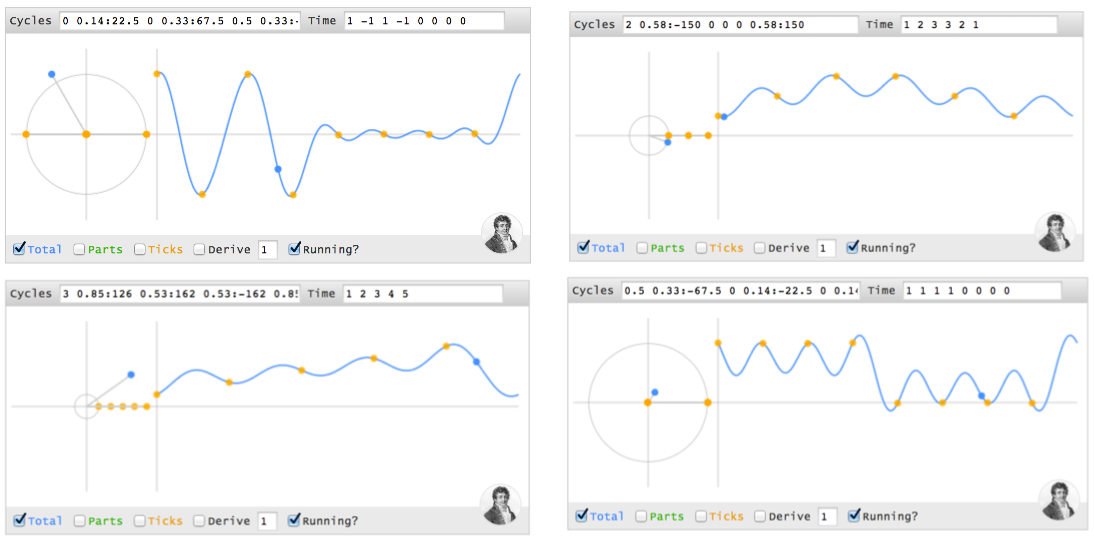
Making A Spike In Time
(4 0 0 0), using cycles? I'll use parentheses () for a sequence of time points, and brackets [] for a sequence of cycles.- At time 0, the first instant, every cycle ingredient is at its max. Ignoring the other time points,
(4 ? ? ?)can be made from 4 cycles (0Hz 1Hz 2Hz 3Hz), each with a magnitude of 1 and phase of 0 (i.e., 1 + 1 + 1 + 1 = 4). - At every future point (t = 1, 2, 3), the sum of all cycles must cancel.
Time 0 1 2 3
------------
0Hz: 0 0 0 0
1Hz: 0 1 2 3
2Hz: 0 2 0 2
3Hz: 0 3 2 1
- Time 0: All cycles at their max (total of 4)
- Time 1: 1Hz and 3Hz cancel (positions 1 & 3 are opposites), 0Hz and 2Hz cancel as well. The net is 0.
- Time 2: 0Hz and 2Hz line up at position 0, while 1Hz and 3Hz line up at position 2 (the opposite side). The total is still 0.
- Time 3: 0Hz and 2Hz cancel. 1Hz and 3Hz cancel.
- Time 4 (repeat of t=0): All cycles line up.
[1 1], [1 1 1], [1 1 1 1] and notice the signals we generate: (2 0), (3 0 0), (4 0 0 0)).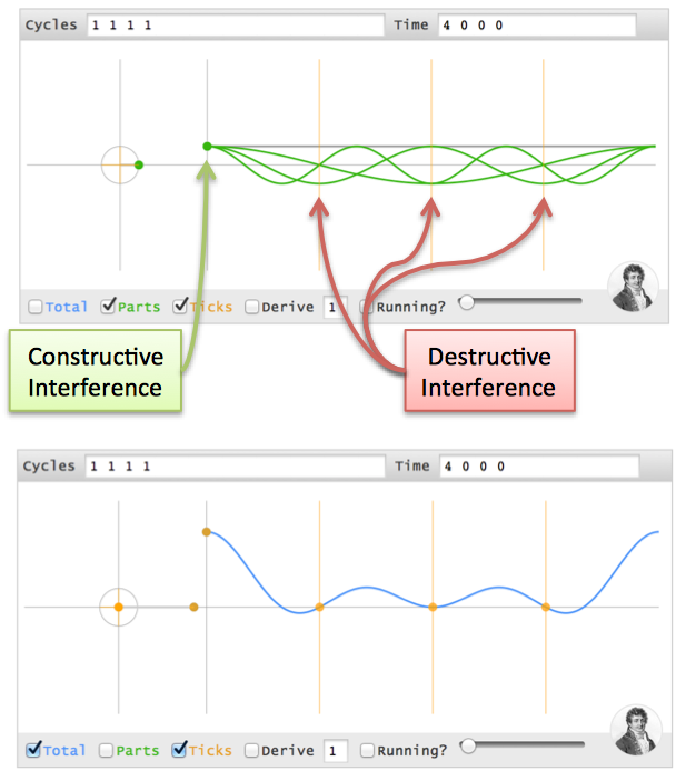
Moving The Time Spike
(0 4 0 0)?(4 0 0 0), but the cycles must align at t=1 (one second in the future). Here's where phase comes in.(4 0 0 0) time pattern. Boring.- A 0Hz cycle doesn't move, so it's already aligned
- A 1Hz cycle goes 1 revolution in the entire 4 seconds, so a 1-second delay is a quarter-turn. Phase shift it 90 degrees backwards (-90) and it gets to phase=0, the max value, at t=1.
- A 2Hz cycle is twice as fast, so give it twice the angle to cover (-180 or 180 phase shift -- it's across the circle, either way).
- A 3Hz cycle is 3x as fast, so give it 3x the distance to move (-270 or +90 phase shift)
(4 0 0 0) are made from cycles [1 1 1 1], then time points (0 4 0 0)are made from [1 1:-90 1:180 1:90]. (Note: I'm using "1Hz", but I mean "1 cycle over the entire time period").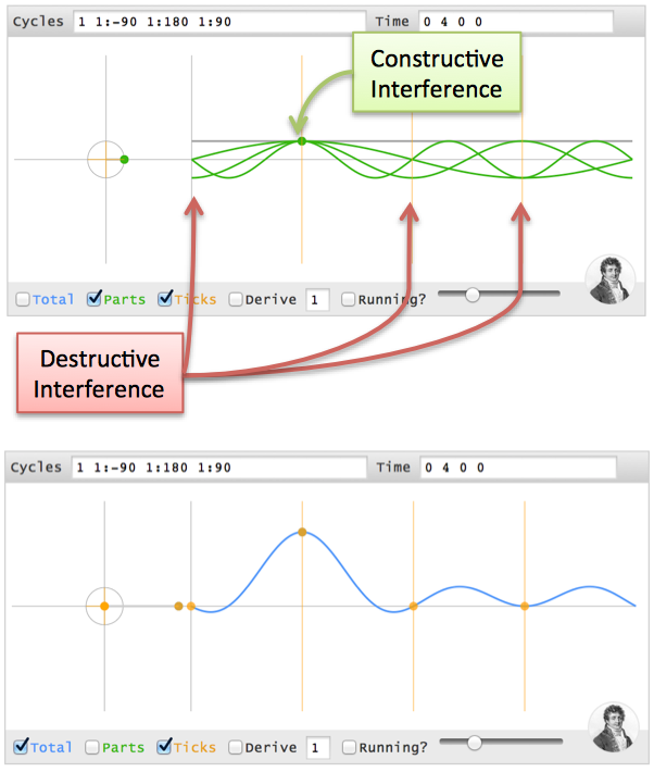
(0 0 4 0), i.e. a 2-second delay? 0Hz has no phase. 1Hz has 180 degrees, 2Hz has 360 (aka 0), and 3Hz has 540 (aka 180), so it's [1 1:180 1 1:180].Discovering The Full Transform
- Separate the full signal (a b c d) into "time spikes": (a 0 0 0) (0 b 0 0) (0 0 c 0) (0 0 0 d)
- For any frequency (like 2Hz), the tentative recipe is "a/4 + b/4 + c/4 + d/4" (the amplitude of each spike is split among all frequencies)
- Wait! We need to offset each spike with a phase delay (the angle for a "1 second delay" depends on the frequency).
- Actual recipe for a frequency = a/4 (no offset) + b/4 (1 second offset) + c/4 (2 second offset) + d/4 (3 second offset).
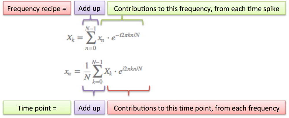
- N = number of time samples we have
- n = current sample we're considering (0 .. N-1)
- xn = value of the signal at time n
- k = current frequency we're considering (0 Hertz up to N-1 Hertz)
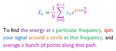
- Xk = amount of frequency k in the signal (amplitude and phase, a complex number)
- The 1/N factor is usually moved to the reverse transform (going from frequencies back to time). This is allowed, though I prefer 1/N in the forward transform since it gives the actual sizes for the time spikes. You can get wild and even use on both transforms (going forward and back creates the 1/N factor).
- n/N is the percent of the time we've gone through. 2 * pi * k is our speed in radians / sec. e^-ix is our backwards-moving circular path. The combination is how far we've moved, for this speed and time.
- The raw equations for the Fourier Transform just say "add the complex numbers". Many programming languages cannot handle complex numbers directly, so you convert everything to rectangular coordinates and add those.
Onward
(1 0 0 0) in my head. For me, it was like saying I knew addition but, gee whiz, I'm not sure what "1 + 1 + 1 + 1" would be. Why not? Shouldn't we have an intuition for the simplest of operations?- Scott Young, for the initial impetus for this post
- Shaheen Gandhi, Roger Cheng, and Brit Cruise for kicking around ideas & refining the analogy
- Steve Lehar for great examples of the Fourier Transform on images
- Charan Langton for her detailed walkthrough
- Julius Smith for a fantastic walkthrough of the Discrete Fourier Transform (what we covered today)
- Bret Victor for his techniques on visualizing learning
Appendix: Projecting Onto Cycles
Appendix: Article With R Code Samples
Appendix: Using The Code
Thursday, July 25, 2019
Tuesday, July 23, 2019
What is Principal Component Analysis?
Introduction


So what is Principal Component Analysis?
 Principal Component Analysis, or PCA, is a dimensionality-reduction method that is often used to reduce the dimensionality of large data sets, by transforming a large set of variables into a smaller one that still contains most of the information in the large set.
Reducing the number of variables of a data set naturally comes at the expense of accuracy, but the trick in dimensionality reduction is to trade a little accuracy for simplicity. Because smaller data sets are easier to explore and visualize and make analyzing data much easier and faster for machine learning algorithms without extraneous variables to process.
So to sum up, the idea of PCA is simply — reduce the number of variables of a data set, while preserving as much information as possible.
Step by step explanation
Step 1: Standardization
The aim of this step is to standardize the range of the continuous initial variables so that each one of them contributes equally to the analysis.
More specifically, the reason why it is critical to perform standardization prior to PCA, is that the latter is quite sensitive regarding the variances of the initial variables. That is if there are large differences between the ranges of initial variables, those variables with larger ranges will dominate over those with small ranges (For example, a variable that ranges between 0 and 100 will dominate over a variable that ranges between 0 and 1), which will lead to biased results. So, transforming the data to comparable scales can prevent this problem.
Mathematically, this can be done by subtracting the mean and dividing by the standard deviation for each value of each variable.
 Once the standardization is done, all the variables will be transformed to the same scale.
Step 2: Covariance Matrix computation
The aim of this step is to understand how the variables of the input data set are varying from the mean with respect to each other, or in other words, to see if there is any relationship between them. Because sometimes, variables are highly correlated in such a way that they contain redundant information. So, in order to identify these correlations, we compute the covariance matrix.
The covariance matrix is a p × p symmetric matrix (where p is the number of dimensions) that has as entries the covariances associated with all possible pairs of the initial variables. For example, for a 3-dimensional data set with 3 variables x, y, and z, the covariance matrix is a 3×3 matrix of this from:

Since the covariance of a variable with itself is its variance (Cov(a,a)=Var(a)), in the main diagonal (Top left to bottom right) we actually have the variances of each initial variable. And since the covariance is commutative (Cov(a,b)=Cov(b,a)), the entries of the covariance matrix are symmetric with respect to the main diagonal, which means that the upper and the lower triangular portions are equal.
What do the covariances that we have as entries of the matrix tell us about the correlations between the variables?
It’s actually the sign of the covariance that matters :
if positive then : the two variables increase or decrease together (correlated)
if negative then : One increases when the other decreases (Inversely correlated)
Now, that we know that the covariance matrix is not more than a table that summaries the correlations between all the possible pairs of variables, let’s move to the next step.
Step 3: Compute the eigenvectors and eigenvalues of the covariance matrix to identify the principal components
Eigenvectors and eigenvalues are the linear algebra concepts that we need to compute from the covariance matrix in order to determine the principal components of the data. Before getting to the explanation of these concepts, let’s first understand what do we mean by principal components.
Principal components are new variables that are constructed as linear combinations or mixtures of the initial variables. These combinations are done in such a way that the new variables (i.e., principal components) are uncorrelated and most of the information within the initial variables is squeezed or compressed into the first components. So, the idea is 10-dimensional data gives you 10 principal components, but PCA tries to put maximum possible information in the first component, then maximum remaining information in the second and so on.
An important thing to realize here is that the principal components are less interpretable and don’t have any real meaning since they are constructed as linear combinations of the initial variables.
Geometrically speaking, principal components represent the directions of the data that explain a maximal amount of variance, that is to say, the lines that capture most information of the data. The relationship between variance and information here, is that, the larger the variance carried by a line, the larger the dispersion of the data points along with it, and the larger the dispersion along a line, the more the information it has. To put all this simply, just think of principal components as new axes that provide the best angle to see and evaluate the data, so that the differences between the observations are better visible.
Step 4: Feature vector
As we saw in the previous step, computing the eigenvectors and ordering them by their eigenvalues in descending order, allow us to find the principal components in order of significance. In this step, what we do is, to choose whether to keep all these components or discard those of lesser significance (of low eigenvalues), and form with the remaining ones a matrix of vectors that we call Feature vector.
So, the feature vector is simply a matrix that has as columns the eigenvectors of the components that we decide to keep. This makes it the first step towards dimensionality reduction because if we choose to keep only p eigenvectors (components) out of n, the final data set will have only p dimensions.
Last step : Recast the data along the principal components axes
In the previous steps, apart from standardization, you do not make any changes on the data, you just select the principal components and form the feature vector, but the input data set remains always in terms of the original axes (i.e, in terms of the initial variables).
In this step, which is the last one, the aim is to use the feature vector formed using the eigenvectors of the covariance matrix, to reorient the data from the original axes to the ones represented by the principal components (hence the name Principal Components Analysis). This can be done by multiplying the transpose of the original data set by the transpose of the feature vector.


References :
[Steven M. Holland, Univ. of Georgia]: Principal Components Analysis
[skymind.ai]: Eigenvectors, Eigenvalues, PCA, Covariance and Entropy
[Lindsay I. Smith] : A tutorial on Principal Component Analysis

Step 2: Covariance Matrix computation

Step 3: Compute the eigenvectors and eigenvalues of the covariance matrix to identify the principal components
Eigenvectors and eigenvalues are the linear algebra concepts that we need to compute from the covariance matrix in order to determine the principal components of the data. Before getting to the explanation of these concepts, let’s first understand what do we mean by principal components.
Principal components are new variables that are constructed as linear combinations or mixtures of the initial variables. These combinations are done in such a way that the new variables (i.e., principal components) are uncorrelated and most of the information within the initial variables is squeezed or compressed into the first components. So, the idea is 10-dimensional data gives you 10 principal components, but PCA tries to put maximum possible information in the first component, then maximum remaining information in the second and so on.
An important thing to realize here is that the principal components are less interpretable and don’t have any real meaning since they are constructed as linear combinations of the initial variables.
Geometrically speaking, principal components represent the directions of the data that explain a maximal amount of variance, that is to say, the lines that capture most information of the data. The relationship between variance and information here, is that, the larger the variance carried by a line, the larger the dispersion of the data points along with it, and the larger the dispersion along a line, the more the information it has. To put all this simply, just think of principal components as new axes that provide the best angle to see and evaluate the data, so that the differences between the observations are better visible.
Step 4: Feature vector
Monday, July 15, 2019
Analysis of Variance (ANOVA)
DISCUSSION ON ANOVA
CRITICAL VALUE
Friday, July 12, 2019
Tuesday, July 9, 2019
Test Concerning Means:Small Sample
Test on Small Sample (t-test)


4. Determine the critical value and critical region
Since the level of significance is 0.025 and df = n – 1 = 6 – 1 = 5, and the alternative hypothesis is left – tailed test, then the critical value (
 = -2.571.
 Reject Ho, if t computed is less than -2.571.
5. Compute the value of the test statistics:
Given:
Sample mean = 11.6 minutes
Population mean = 12 minutes
Standard deviation = 2.1 minutes
Sample size = 6 samples

6. Decision: Since the computed t = -0.47 is in the acceptance region, thus, we fail to reject Ho.
7. Conclusion:
Test Concerning Means:Large Sample
Test Concerning Means
One sample Case

Test Concerning Means: Large Sample (z-test)
Solution: Following the steps in hypothesis testing we have
1. State the null and alternative hypothesis. Mathematically,
Ho: μ = 36 months (The average lifetime of lightbulbs is 36 months. Or the average lifetime of lightbulb is not different to 36 months)
Ha: μ ≠ 36 months (The average lifetime of lightbulbs is not equal to 36 months. Or the average lifetime of lightbulb is different to 36 months)
2. Level of significance α = 0.01.
3. Select an appropriate test statistic.
The test statistic is the z – test, the sample size is greater 30 and the formula is


6. Decision: Since the computed z = - 3.54 is in the rejection region, thus, reject Ho and accept Ha: μ ≠ 36 months
7. Conclusion: